meus
This is a school project for the class of user-Interface/user-experience Design for the Web. Through designing an e-commerce website for a small business, I gained a deeper understanding of how user experience design facilities a business connect and communicate with their customers.
Client:
MEUS, an online store that offers selective home and living products.
Site Objective:
Brand Identity: MEUS is an online shop dedicated to thoughtful and inspired living. They offer hand-picked essentials that make everyday life more beautiful. Their philosophy is to form meaningful connections with the things you own. From putting on an understated scarf that makes you feel poised and confident to soothing away the day’s stresses with a piping-hot drink from an over-sized handmade mug, everyday living should never be ordinary.
Business goal :The website will be designed to be a fully functional e-commerce website in a clean and aesthetic style. The MEUS carries living products and clothing from selective independent brands. They want to connect with the customers through their beautiful and well-designed products and love to see them return for more goods. A great online shopping experience will be the key to achieve this goal.
Current Site Problem:
- The home page of the original website is not well-designed. First, it doesn't do a good job on representing the company. Second, it fails to effectively engage with the audience by offering sufficient directions and recommendation to shop. Instead, the home page is crowded by stacked products.
- The product detail page doesn't include the breadcrumb which allows users to keep tracking their location within the page. The product description needs to be more scannable.
- The checkout page is currently linked with Paypal. It might need a full checkout design in the future.
Solutions:
- home page re-design. The company's products feature in crafts and gifts for kids. So I designed the call to actions for product recommendations around these two categoriesIn order to further engage with the audience, I create more shopping direction along with the tag lines that associate with target customers lifestyle. I also add an editor's pick of the week down at the bottom for offering more suggestions. I re-organized the main navigation by adding the women category to appeal its majority group of potential customers. Since the products are mostly one of a kind and slightly pricey, I add a gift guide category to the navigation as another shopping cause.
- product detail page re-design. The breadcrumb is added to the top of the product description. I broke up the product introduction into 4 tabs to make it more scannable and easy to navigate.
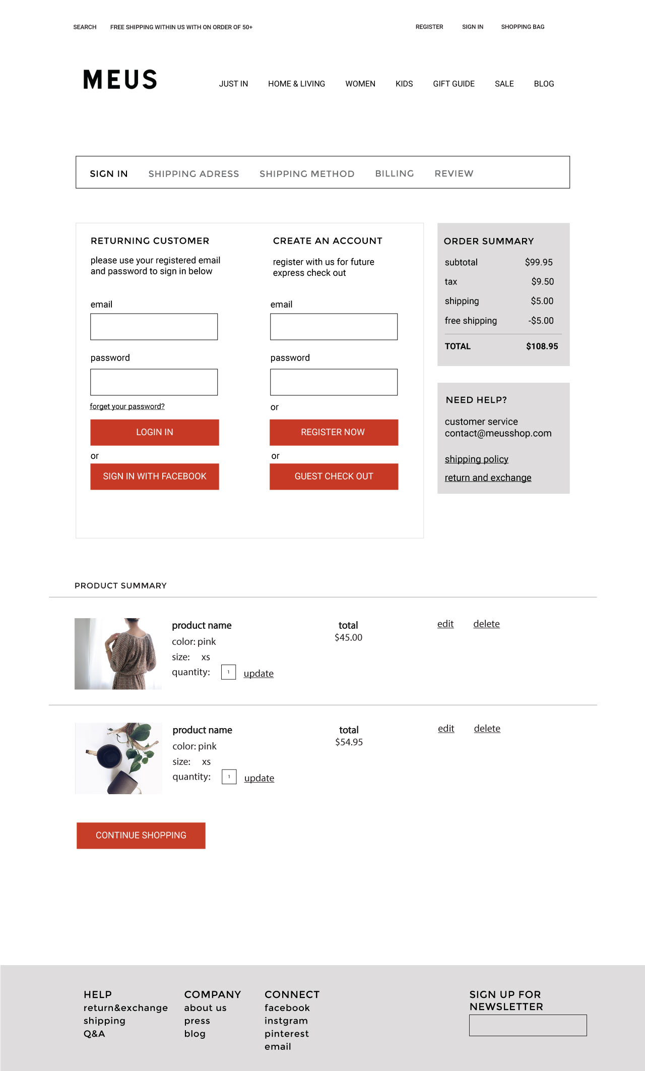
- Design the complete steps of the checkout process. It includes clear step navigation, order summary ,product summary, and helping section.


